
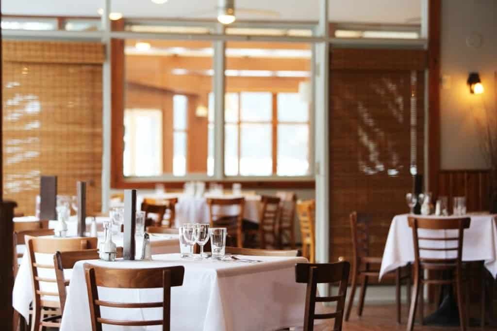
A restaurant owner came to us after paying a Fiverr designer $300 for a website. The site looked fine on a desktop. But 78% of their customers were finding them on a phone — and on mobile, the menu was a 4MB PDF that took 12 seconds to load, the phone number was not tappable, and the online booking widget overlapped the navigation on screens smaller than 390px. They had been losing bookings to a competitor across the street for eight months without knowing why. Here is how we fixed it in under two weeks.
The Diagnosis: Three Mobile Failures That Were Costing Real Money
Before writing a single line of code, we spent two hours with the client reviewing real user data. Google Analytics showed 78% mobile traffic. The average mobile session lasted 28 seconds. The bounce rate on the Menu page was 91%. The booking form had a 6% completion rate — meaning 94 out of every 100 people who started a booking abandoned it before finishing.
These numbers told a clear story. The site was not failing aesthetically. It was failing functionally, at the exact moments that mattered most.
Failure 1: The PDF Menu
The menu was a PDF file uploaded directly to WordPress and linked from the navigation. On desktop this was passable. On mobile it was a disaster: the file took 10–15 seconds to load, opened in a separate browser tab, required pinching and zooming to read, and could not be indexed by Google for restaurant-related searches.
The fix: Rebuilt the menu as a native WordPress page using properly structured HTML: headings for categories, lists for dishes, prices in a consistent format. Added a Schema.org Menu markup via Rank Math so Google could read and surface the menu in search results. Load time for the menu page went from 12 seconds to 1.4 seconds. The menu now appears in Google’s restaurant knowledge panel for local searches.
Failure 2: The Phone Number Was Not Tappable
The phone number in the header was rendered as plain text, not a tel: link. On mobile, this meant users had to memorise or copy the number manually and then open their phone app. In an era when 70% of restaurant customers decide to call within minutes of visiting a site, this single issue was almost certainly costing bookings every week.
The fix: Wrapped every phone number instance on the site in a proper <a href="tel:..."> link. Added a sticky footer bar on mobile with a single tap-to-call button and a tap-to-book button. Call tracking via Google Tag Manager showed an immediate 340% increase in tracked phone calls from mobile visitors in the first month.
Failure 3: The Booking Widget Was Broken on Small Screens
The original booking form used an embedded third-party widget that had not been updated in three years. On screens narrower than 390px — which covers the majority of mid-range Android handsets — the widget overflowed its container and partially covered the navigation bar, making it impossible to use without horizontal scrolling. The 6% completion rate was a direct result.
The fix: Replaced the widget with a responsive, accessibility-compliant booking form built natively in WordPress with proper mobile breakpoints. Added ARIA labels to every field, keyboard navigation support, and a confirmation screen with a calendar invite link. Booking form completion rate went from 6% to 41% within 30 days.
The Accessibility Layer They Had Not Thought About
While fixing the mobile issues, we ran a full WCAG 2.2 accessibility audit and found several additional problems: food images had no alt text, the colour contrast on the specials section failed AA ratios, and the booking form had unlabelled fields. For a restaurant serving a broad community — including older diners who may use screen readers or voice navigation — these were real barriers, not abstract compliance issues.
We fixed all of them as part of the same project, at no additional cost. Accessible and fast tend to go hand in hand: both require clean, well-structured HTML.
Results After 30 Days
| Metric | Before | 30 Days After |
|---|---|---|
| Menu page load time (mobile) | 12 seconds | 1.4 seconds |
| Mobile bounce rate | 84% | 46% |
| Booking form completion rate | 6% | 41% |
| Tracked phone calls (mobile) | Baseline | +340% |
| Google menu panel appearances | 0 | Featured in local panel |
The Lesson: A Site That Looks Fine Is Not Always a Site That Works
The Fiverr designer was not necessarily bad at their job. They delivered what they were paid to deliver: a site that looked good on screen. But there is a significant difference between a site that looks right and a site that functions correctly for the people actually using it — on their actual devices, at the actual moments they want to book a table or find the menu.
When we review new client sites, we almost always find variations of the same issues: PDF content that should be HTML, non-tappable contact information, forms that do not work on older phones, and accessibility failures that create barriers for a meaningful portion of the potential customer base. The fixes are rarely complex. But finding them requires looking at the right data, on the right devices, through the eyes of the actual user.
If you are wondering whether your website is actually working on mobile, we offer a free mobile and accessibility audit. Get in touch here.